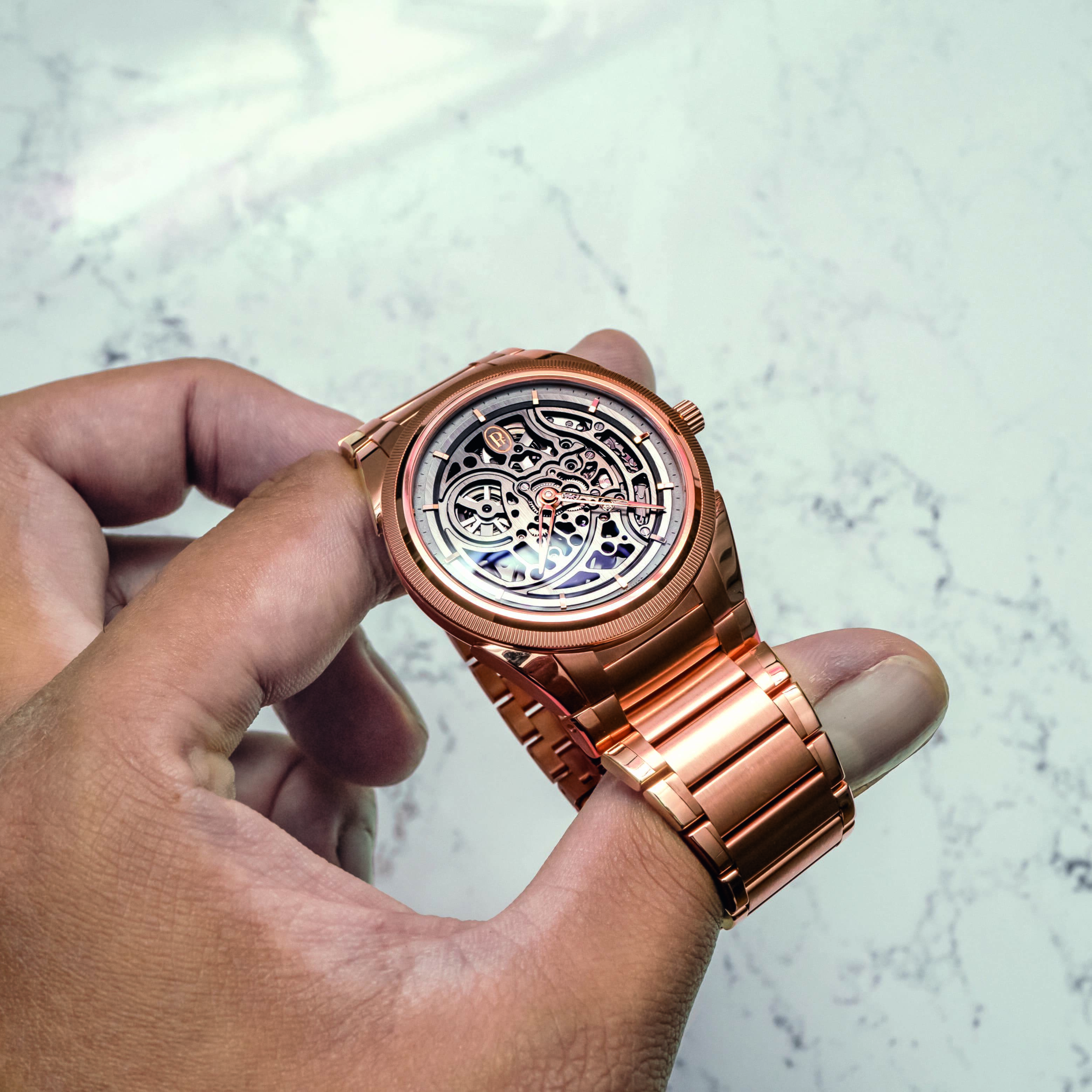
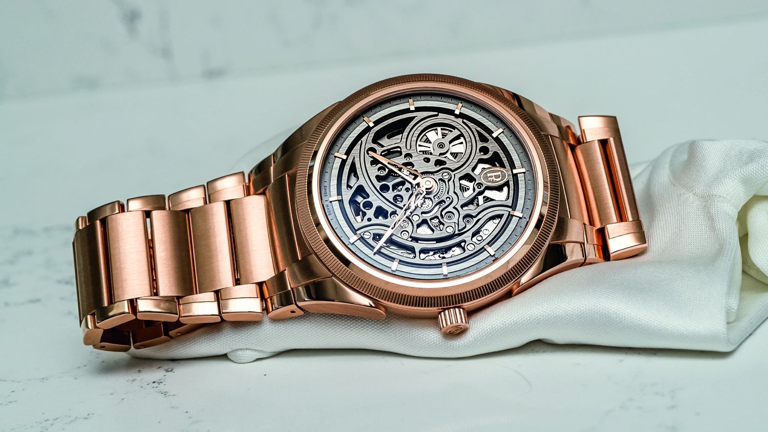
Skeletonisation has been seeing a steady revival the past few years, with S-tier releases or line updates from Audemars Piguet, Vacheron Constantin, and Parmigiani all largely within their integrated bracelet sports watch collections. Anecdotally, I’ve observed a noticeable uptick in appreciation for the skeletonised arts by younger enthusiasts, as well. Still, a generation of collectors (present company included) had been trained to largely dismiss skeletonisation as either a musty baroque technique that flouts admittedly arbitrary standards of ‘minimalism’, or worse, a generic ‘luxe’ add-on seemingly conceived with the sole purpose of spoiling legibility. But, these days it seems there is renewed hope …
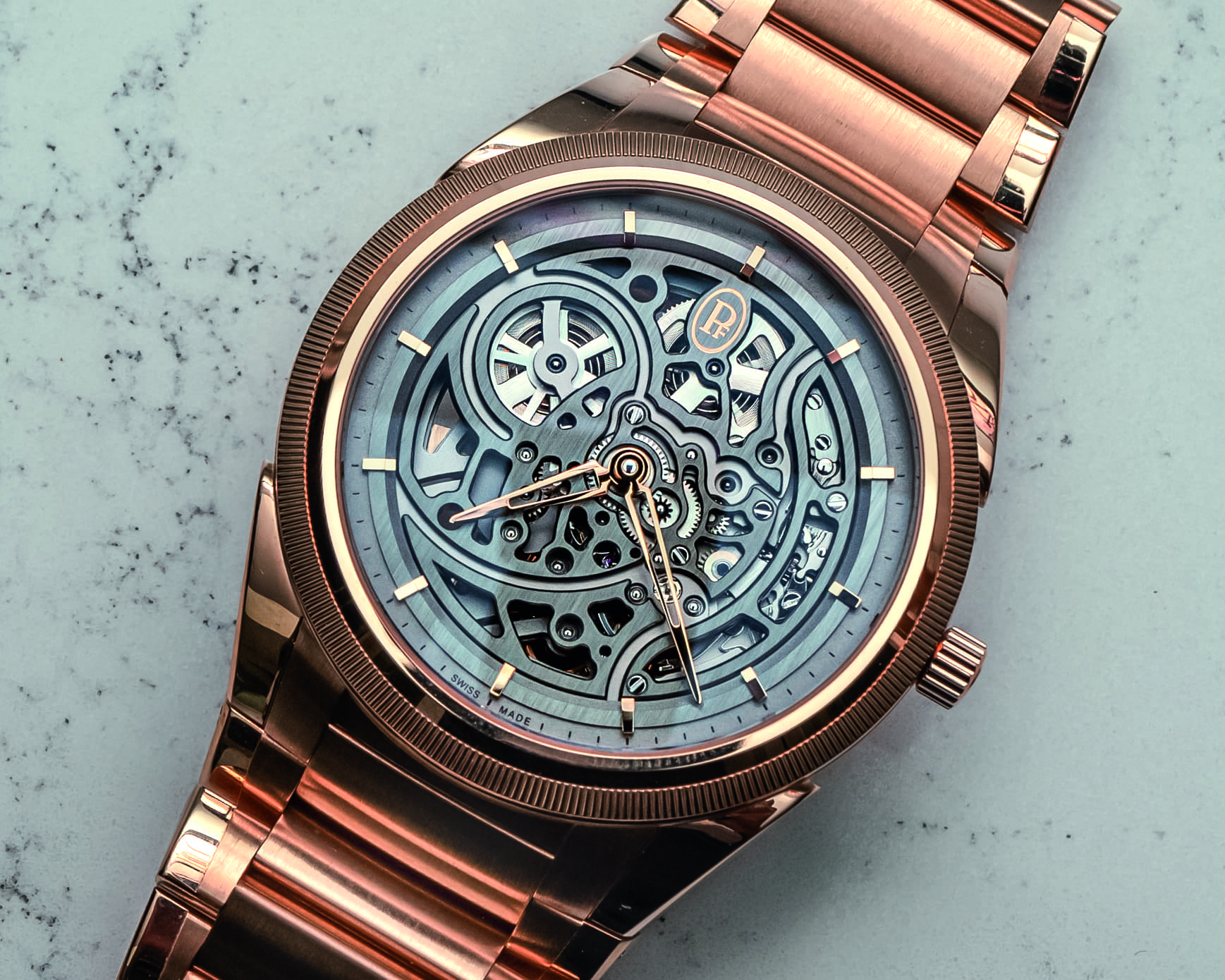
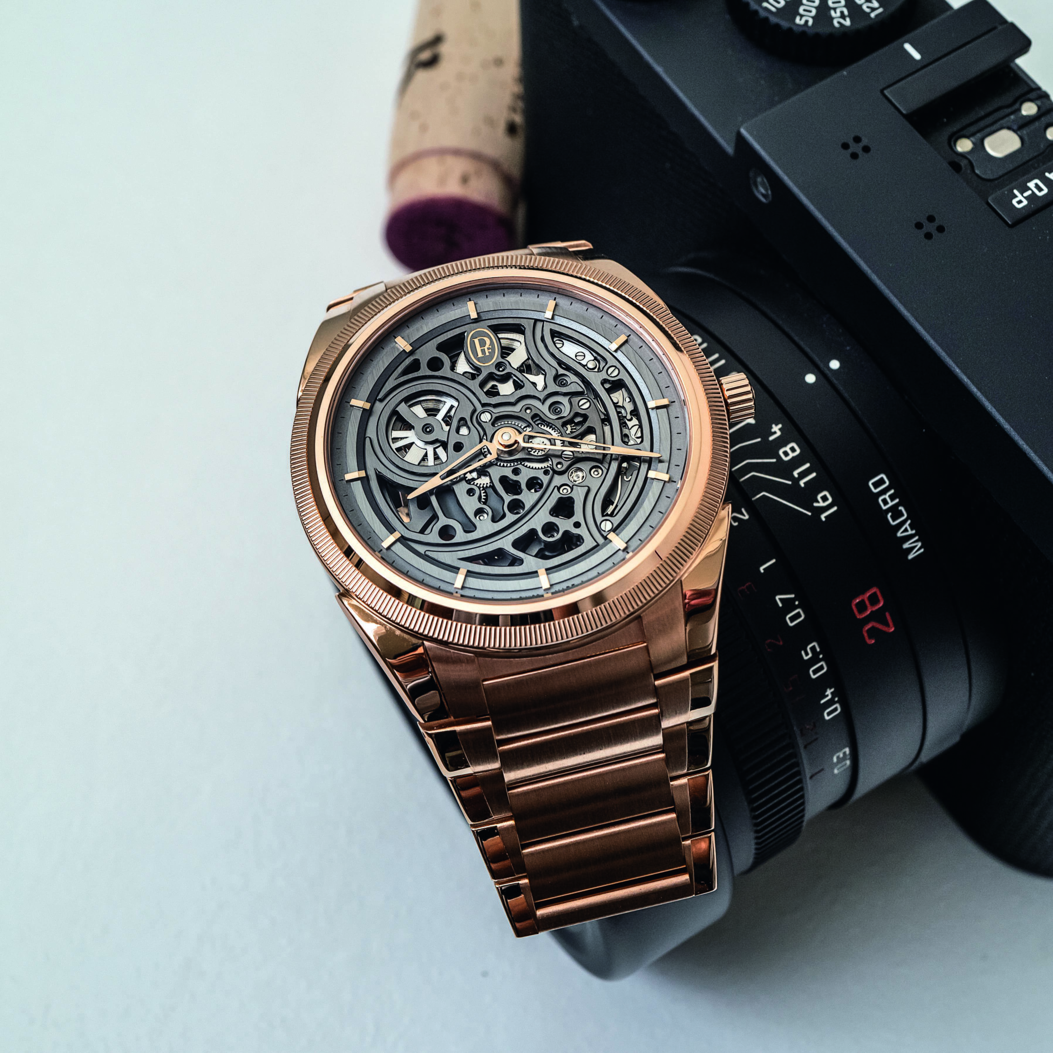
“Wow, that’s legible!” is the G-rated edit of a refrain that I uttered at both my meeting with Parmigiani and later during my week with this watch. And the fact remains: It really is very, very legible! The sad truth is that a skeletonised dial with a set of polished gold hands would, in a vast majority of cases, be an illegible mechanical salad. Here all the curving and sweeping bridges are done with a graphite finish that lends a matte and monochromatic dial for the delta-shaped hands to contrast against. The wheels and remainder of the components are finished with rhodium plating, which matches the mellowness of the colour scheme. The hand-chamfered edges of the bridges create a polish that is a nice contrast to the sandblasted and vertical brushing finishes throughout the dial.
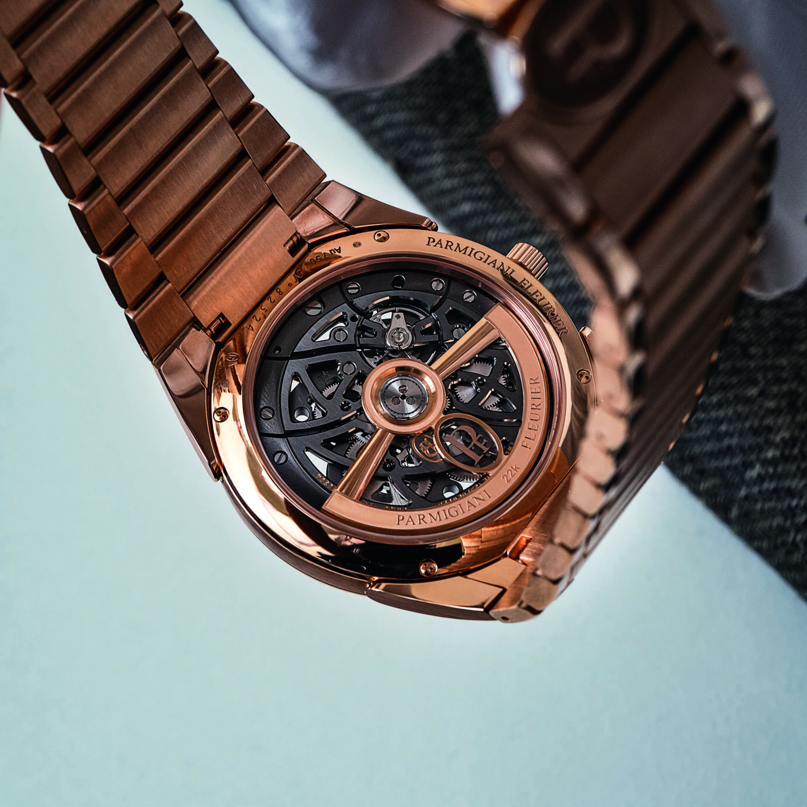
There are thoughtful and meticulously executed little details all over this watch. Take the hour indexes, for example. While they appear fairly ordinary at first glance, a closer look shows that they are affixed to the dial only on one side at the rehaut, at which point they almost cantilever over the vertically brushed ring. Plus, the chamfered edge lines up with the satin-brushing of the innermost ring before the dial’s skeletonised core begins. And on the caseback, note that the rotor has a sapphire crystal oval housing the PF insignia. It’s just a little touch that adds to the lightness and airiness of a skeletonised watch.
 The PF777 calibre movement with a unique sapphire- encased insignia on the rotor
The solid gold rotor is, like the hands and indexes on the dial side, the only non-monochromatic aspect on the caseback. The automatic in-house Caliber PF777 operates at 4Hz and has a 60-hour power reserve. No, it’s not a micro-rotor or manual-wind movement, which I know some people were hoping for, but in terms of practicality and execution, I have no qualms.
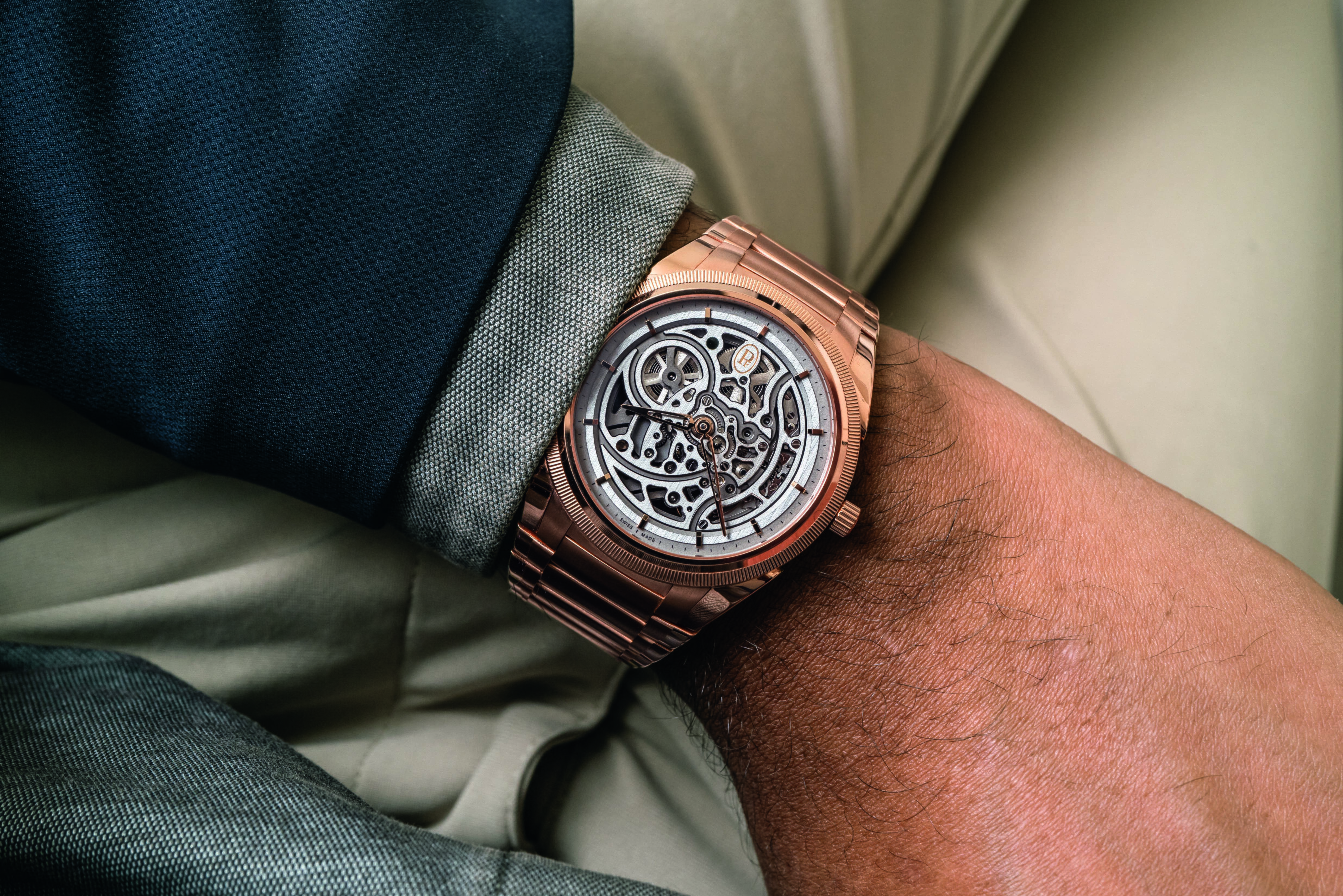
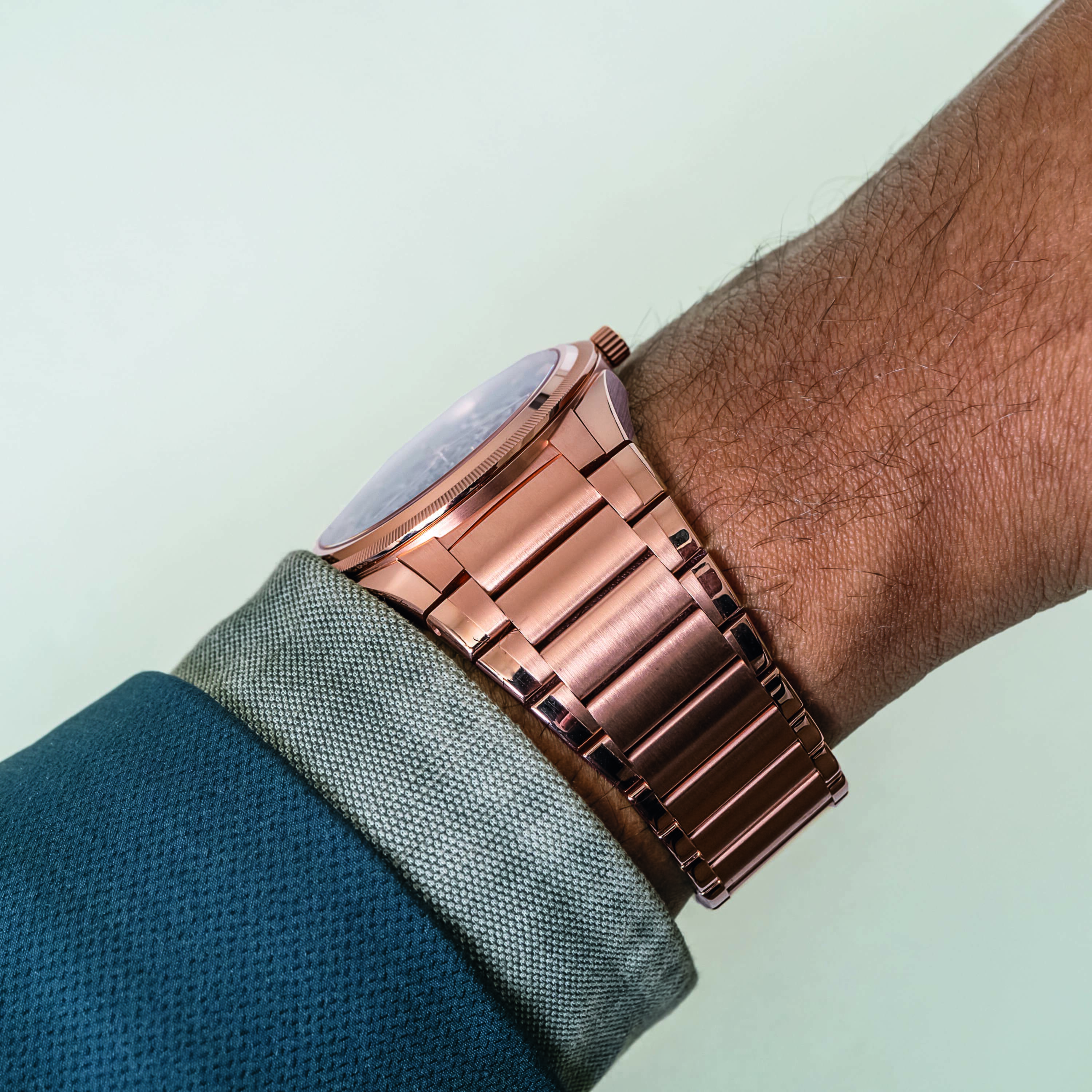
This is especially true when considering the measurements of the watch. Automatic movements can have the unfortunate side effect of adding heft to a case but there’s not much to complain about with an 8.5-mm-thick case. Again, I find this makes for a size for everyday wear. Well, maybe the steel model is better as an everyday wear but the point stands.
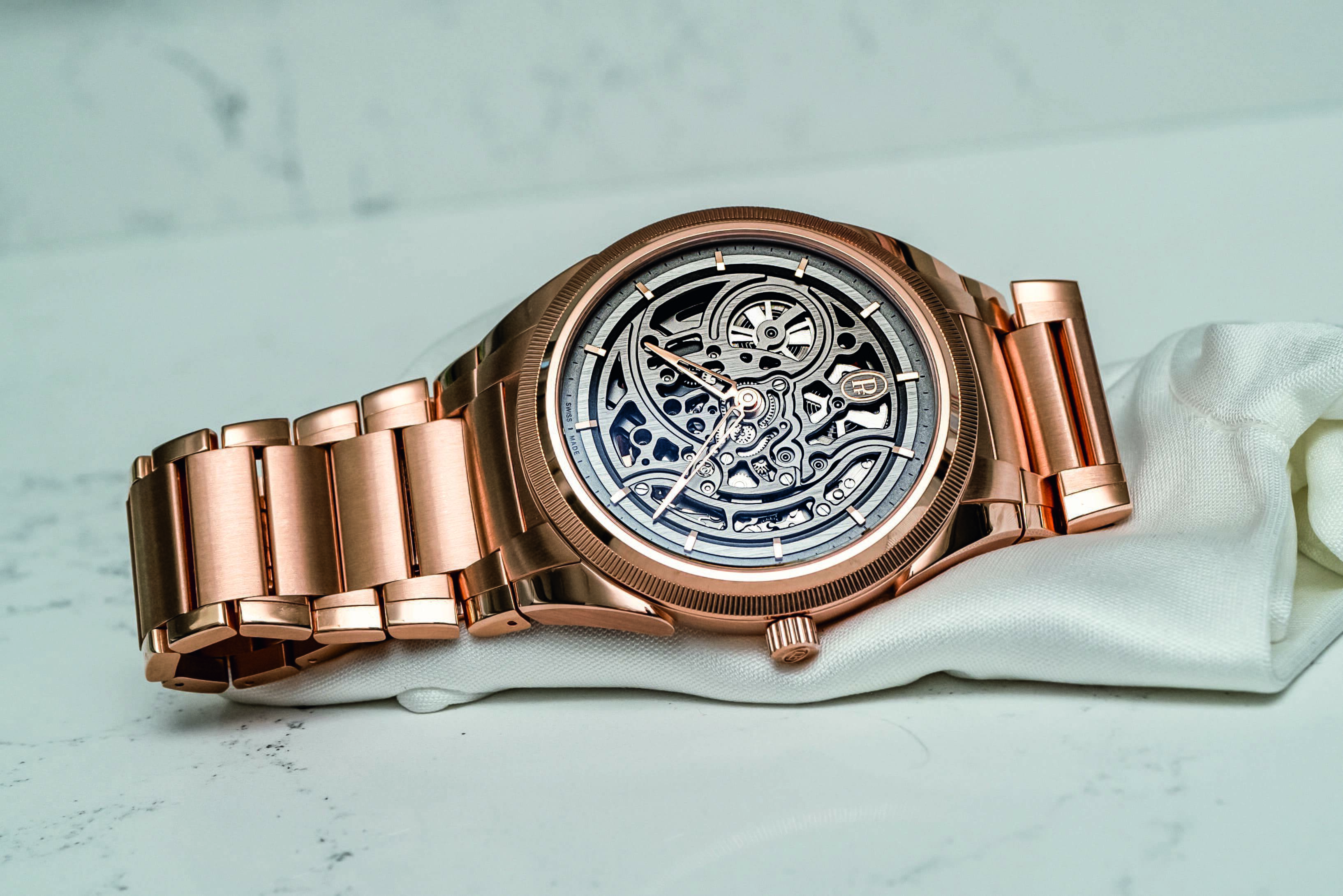
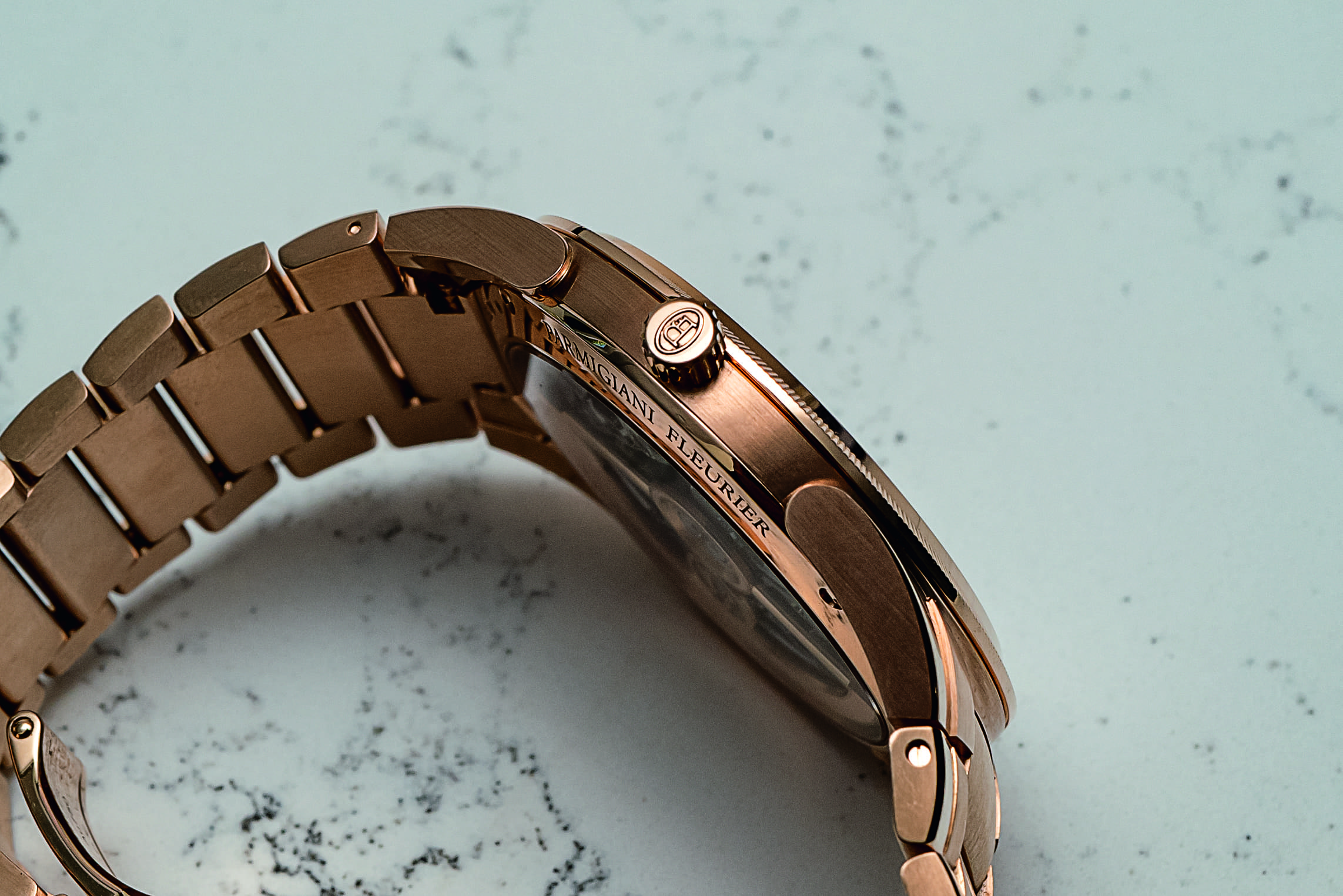
 The signature Parmigiani Fleurier teardrop-shaped lugs
The curving, sweeping lines of the movement embrace a decorative and relatively unusual interpretation of skeletonisation that is not preoccupied with cutting off as much as possible. In the old days, skeletonisation was about creating a unique canvas with which to show off exceptional finishing and decorative skills. These are gorgeous when done properly and have a strong collector community that will pay exorbitant prices for pieces like the Patek Philippe Ellipse Ref. 3880 or certain Breguet references. For most contemporary buyers, this ornate style fell out of fashion some time ago and the skeletonised options in recent years have been lacklustre overall. However, it does seem like we have seen a new take on skeletonisation that is gaining momentum by refocusing the technique to serve the tastes of younger buyers open to appreciating mastery of the technique in a modern style.
Still, contemporary time-only skeletonised watches have largely lent themselves to a ‘decorative minimalism’ aesthetic that’s the inevitable result of exposing the bare bones of a relatively simple movement. Many fail at this because oftentimes the result seems arbitrary and not particularly attractive, making one question the whole purpose of the exercise in the first place.
One watch that does time-only skeletonisation well is the Cartier Santos, which has its empty outer dial section framed with bridges done as Roman numerals. This way one can appreciate seeing through the ‘bones’ and out the other side of the case while retaining the purpose of a watch as a time-telling device with a cogent design behind it. And then there are the complicated skeletonised watches that do not open things up with the purpose of laying the bones bare, but rather to heighten appreciation of the inner workings. A brand that used to be known for more ornate, decorative skeletonisation is Vacheron Constantin who keenly understood the changing tastes of contemporary collectors when they released the Overseas Perpetual Calendar Ultra-thin Skeleton in 2020.
There are not many examples, but some brands have seen stellar results by prioritising legibility and crisp finishing over purely traditional interpretations of skeletonisation. The Czapek Antarctique Rattrapante focused its use of skeletonisation by coupling the technique with a movement that shows the split-seconds mechanism on the front of the dial. I’d also be remiss in not mentioning the Slim d’Hermès Squelette Lune that, like the Parmigiani, used darker and more muted matte finishes on the bridges and throughout.
And then there’s the Audemars Piguet Royal Oak Ref. 15305. Released in 2010, the 15305 was the watch that brought skeletonisation to a new generation. By opening up the Caliber 3120 and largely sticking to anthracite or gray finishes, the 15305 had a skeletonised dial that matched the industrial vibe of the Royal Oak. Adapting this oftentimes stuffy technique to match the style of the Royal Oak was a stroke of genius that has left an indelible mark on the segment.
In many ways, the Tonda PF Skeleton takes this same attitude. Proportionality and beautiful curves are central to Parmigiani’s identity and are core elements of brand founder Michel Parmigiani’s design ethos. Anyone who knows me knows how big an admirer of Parmigiani I am, both of the man and the brand. However, it wasn’t until the Tonda PF collection that everything cohesively came together by putting the Parmigiani DNA on full display but in a package the market will truly embrace. The sweeping curves of the bridges casually adhere to the Golden Ratio and the curves echo the rounded edges of the case and the recognisable teardrop lugs.
I’ll spare you the tired conversation about how popular integrated bracelet sports watches (though ‘leisure watches’ is more apt) are these days, though it is an obvious factor in this collection’s success. For the collector who wants something a little different from the usual offerings, getting some time with the Parmigiani Tonda PF Skeleton on the wrist is well worth the effort.
Images Courtesy: Brand
